
Product Design Case Study
Reducing setup friction in Loopsy's pattern & stash creation
Renovating how crafters discover & create patterns and fiber arts supplies within the app, turning a manual, import-heavy setup into an active, discovery experience.
- Role
- Product Designer
- Platform
- iOS
- Type
- Feature Redesign
Highlights
The Challenge
Pattern and stash creation relied heavily on manual imports and setup, creating friction that delayed users from starting new crafting projects.
My Approach
Shifted the experience from management-focused to discovery-focused by introducing search-first workflows, visual browsing cards, community-driven recommendations, and quick-add actions.
The Outcome
- +24%Pattern Creation Completion
- +19%User Activation Rate
- +17%Discovery Feature Engagement
01
Background
Loopsy is a mobile companion for knitters and crocheters that brings pattern discovery, stash management, and project tracking into one place. This case study focuses on the pattern and stash creation flows, where users can import knitting/crochet patterns and supplies into the app to start tracking their projects and progress.
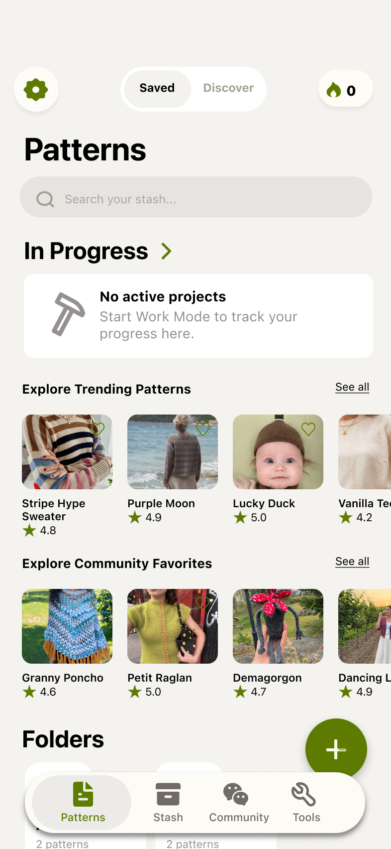
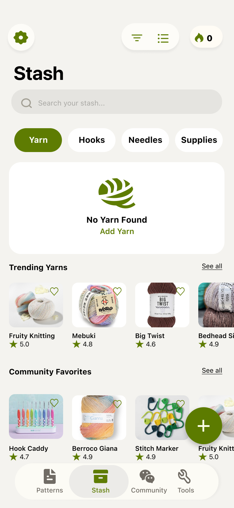
As seen below, the pattern and stash creation flows are extremely manual and dense, expecting users to have expansive details on patterns or stashes within the import form. Users, new & existing, became frustrated with having to fill out all of these details every time they wanted to start a new crafting project or bought new supplies from the craft store, which is what this design seeks to solve.
02
Problem
Pattern and stash creation requires too much manual input from users and needs a better flow.
Users experienced friction when importing crafting patterns, leading to low activation and a weak transition into crafting workflows.
Opportunity / Design Challenge
03
Initial Exploration & Research
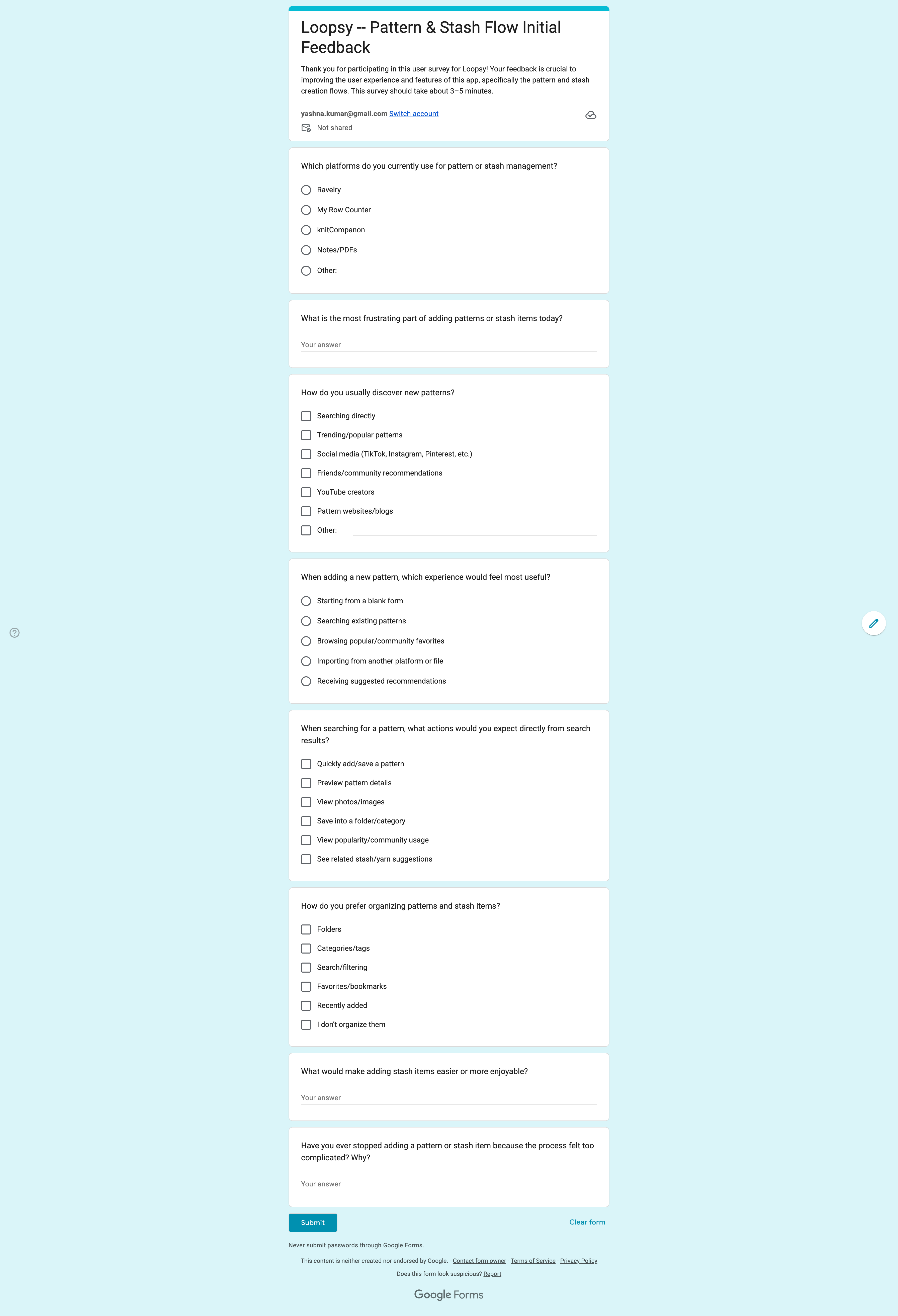
I have a friend who is part of a small local crafting community, so I surveyed 5 members to get their insights on the current state of Loopsy's pattern and stash creation flows. The main points for improvement among the surveyors were:
1. Users relied heavily on community validation during pattern discovery
Most participants expressed wanting to browse patterns through popularity, trending sections, reviews, and completed projects rather than searching blindly. Participants noted that community activity increased confidence before committing to a project.
“If a lot of people made it already, I trust it more.”
“I want to know what everyone else is making right now.”
4 out of 5 participants selected popularity, reviews, or community usage as important factors when choosing patterns.
2. Pattern and stash setup flows introduced significant friction
Participants consistently described current workflows as overly manual, repetitive, and dependent on imports from external platforms or files. Several users expressed frustration with needing to connect apps, upload PDFs, or manually enter information before starting a project.
“Why do I have to import everything just to add one pattern?”
“It feels like setup work before I can actually craft.”
4 out of 5 participants reported abandoning or delaying adding patterns or stash items because the process felt too complicated or time-consuming.
3. Users expected search-first workflows with quick-add functionality
Most participants assumed they would be able to search for patterns and immediately save or add them directly from search results. Users preferred lightweight workflows that minimized navigation and reduced the number of setup steps required.
“I just want to hit add without opening five screens.”
“If I already searched for it, I shouldn’t have to manually recreate it.”
All 5 participants identified search and quick-add actions as important features during pattern creation.
4. Visual content and contextual recommendations improved engagement
Participants consistently referenced photos, previews, and related yarn suggestions as important during both pattern and stash creation. Many users wanted systems that proactively surfaced popular or commonly paired items instead of requiring manual searching.
“I want inspiration while I’m adding things.”
“Seeing similar yarns or popular pairings would make the process feel way smarter.”
4 out of 5 participants said visual previews and related recommendations would make them more likely to complete stash or pattern setup.
04
Competitive Analysis
I evaluated three leading platforms in the crafting space to understand how they handle pattern discovery, creation, and stash management, and where Loopsy could differentiate.
| Competitor | Overview | Competitive Advantage | Heuristic Evaluation | Notes |
|---|---|---|---|---|
| Ravelry | Large-scale knitting and crochet community platform with integrated pattern discovery, stash management, and project tracking. |
|
|
|
| My Row Counter | Mobile crafting tracker focused on row counting, pattern organization, and project management workflows. |
|
|
|
| knitCompanion | Advanced knitting app centered around interactive PDF patterns, annotations, and detailed tracking tools. |
|
|
|
05
Competitive Insights
Across knitting and crochet pattern management platforms, several consistent opportunities and strengths emerged:
1. Community-driven discovery plays a major role in pattern engagement
Platforms like Ravelry emphasize trending patterns, popularity metrics, reviews, and project photos throughout the browsing experience. These features help users discover patterns more confidently and create stronger engagement during exploration.
2. Pattern creation workflows depend heavily on imports and external systems
Competitors such as My Row Counter and knitCompanion rely on importing PDFs, connecting to Ravelry, or uploading local files before users can begin organizing projects. These workflows create additional setup steps and increase onboarding complexity.
3. Visual content strongly supports pattern discovery and inspiration
Platforms that incorporate project photos, previews, and community-generated content create more engaging browsing experiences and help users evaluate patterns more easily before adding them to projects or collections.
06
Insights → Opportunities
After analyzing the information from both user and competitive insights, the next step was to convert the insights into actionable opportunities.
| Insight | Opportunity |
|---|---|
| Community-driven discovery plays a major role in pattern engagement | Introduce “Trending” and “Community Favorites” sections within both Pattern and Stash creation flows to help users discover popular patterns, yarns, and commonly used materials more confidently. |
| Pattern and stash creation workflows depend heavily on imports and external systems | Streamline onboarding by simplifying imports and enabling users to search, preview, and quickly add both patterns and stash items directly within the app. |
| Visual content strongly supports discovery and inspiration | Expand the use of previews, project photos, and detail pages across both Pattern and Stash flows to improve confidence, inspiration, and decision-making during browsing and setup. |
07
Exploring Design Directions
I then explored different directions to display these opportunities within the app, weighing each option against the goal of keeping discovery lightweight and setup fast.
Opportunity: Introduce “Trending” and “Community Favorites” sections
For Pattern Discovery
- Option A
Dedicated “Trending Patterns” page
- Option BChosen
Horizontal “Popular Right Now” carousel within Add Pattern flow
- Option CChosen
Community popularity integrated directly into search results
Decision: I chose a combination of B and C to surface community-driven discovery throughout the workflow without forcing users into a separate browsing experience. This keeps discovery lightweight while still increasing confidence and inspiration during pattern creation.
For Stash Discovery
- Option A
Display popular supplies by category (Yarns, Needles, Hooks, etc
- Option BChosen
Suggest stash items based on selected pattern
- Option C
Create a separate “Popular Yarns��� browsing tab
Decision: I chose A to de-couple the stash items from patterns. Each category of supply is easily browsable for users.
Opportunity: Streamline onboarding with search and quick-add
For Pattern Creation
- Option A
Require imports through Dropbox/Ravelry/local files only
- Option BChosen
Search-first flow with quick-add actions
- Option C
Manual pattern creation form
Decision: I chose B to reduce onboarding friction and minimize repetitive setup work. Allowing users to quickly add patterns directly from search aligns more closely with modern mobile-first workflows.
For Stash Creation
- Option A
Manual yarn entry form
- Option BChosen
Search existing yarn database with quick-add
- Option C
Import stash from external platforms
Decision: I chose B coupled with optional imports to balance speed and flexibility. This lets users rapidly add stash items while still supporting advanced workflows when needed.
Opportunity: Expand previews, project photos, and detail pages
For Pattern Details
- Option A
Text-only search results
- Option B
Image-focused browsing cards
- Option CChosen
Search results with expandable detail pages
Decision: I chose C to balance scanability with deeper exploration. Users can quickly browse patterns while still accessing richer information before adding them.
For Stash Details
- Option A
Simple yarn list view
- Option BChosen
Visual stash cards with yarn previews
- Option CChosen
Contextual stash recommendations tied to patterns
Decision: I chose B make stash management feel more engaging and visual while being decoupled from pattern workflows.
08
Iterations & Feedback
After exploring design decisions, I created initial wireframes and prototypes to validate the search-first, discovery-led direction.
Low-fidelity wireframes
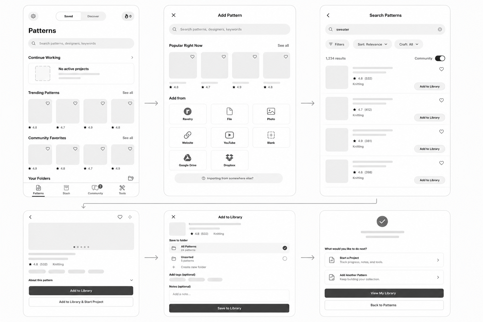
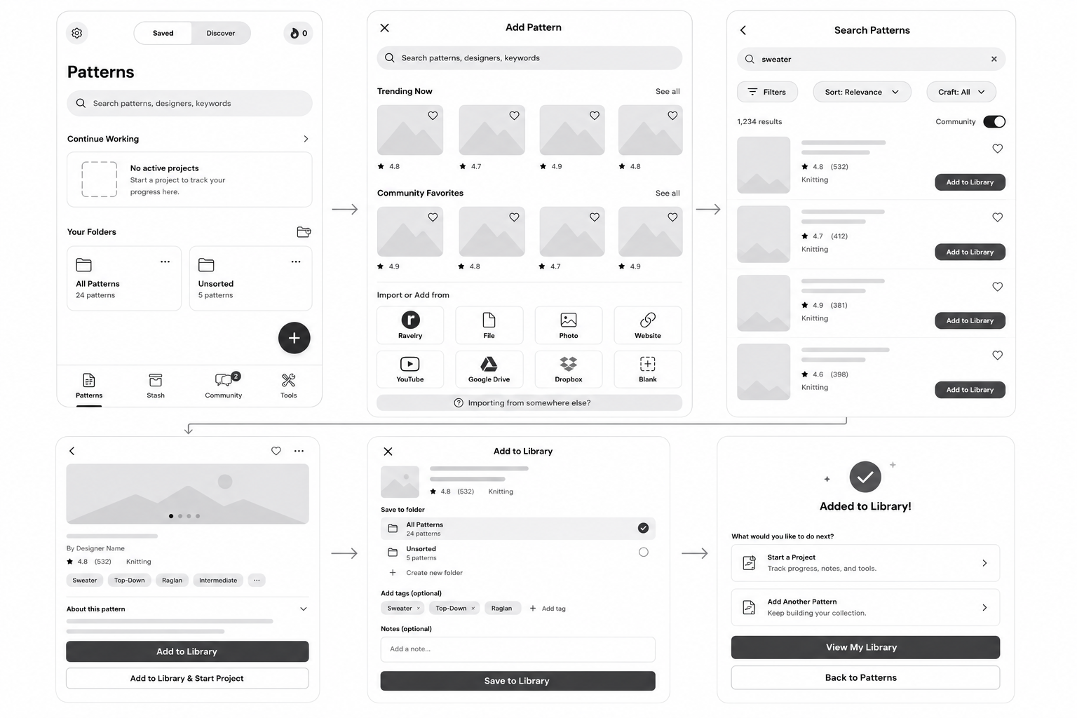
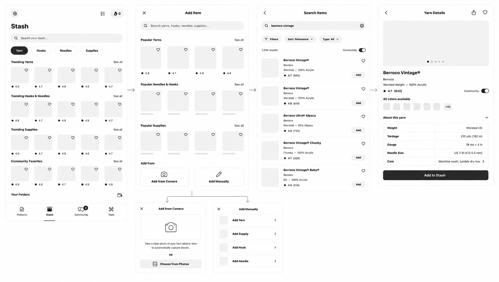
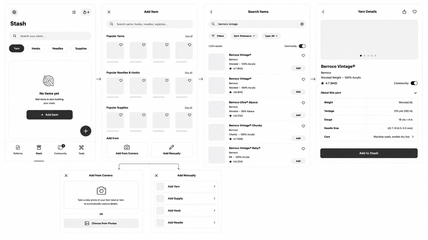
I created two versions per Pattern and Stash flow to compare structure and entry points before committing to visuals. The first flow introduces discovery within the respective screens via card carousels as well as in a popup Search screen. The second flow only encourages discovery through search. I wanted to engage the survey participants and the Loopsy founder/engineer before solidifying a design.
Option 1 - Pattern + Search
Option 2 - Search Only
Option 1 - Stash + Search
Option 2 - Search Only
First iteration: high fidelity
The first high-fidelity pass translated the wireframes into the Loopsy visual language. These screens were the basis for feedback that led to the refined final designs in the next section. After getting feedback, option 1 of both stash & pattern flows were preferred. Participants liked the introduction of visual cards right away within pattern/stash screens since it tends to be mostly gray and dull unless the user has multiple projects in progress. Newer users also preferred being able to explore crochet & knitting patterns without needing any prior knowledge or experience.
Stash v1
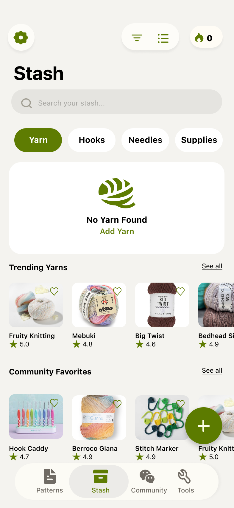
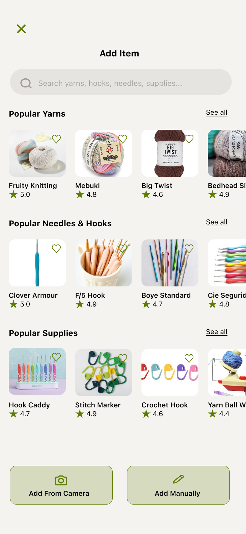
Introduced Trending Yarns & Community Favorites sections with supply card carousels. “See all” leads to the next screen.
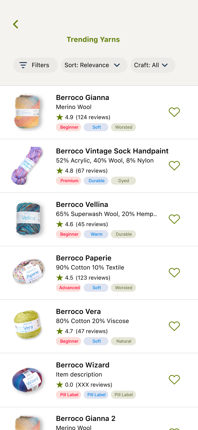
Trending Yarns or Community Favorites displays a scrollable list of discoverable supplies. Includes filters, categorizable pills, and reviews. Users can also quick-add from this screen.
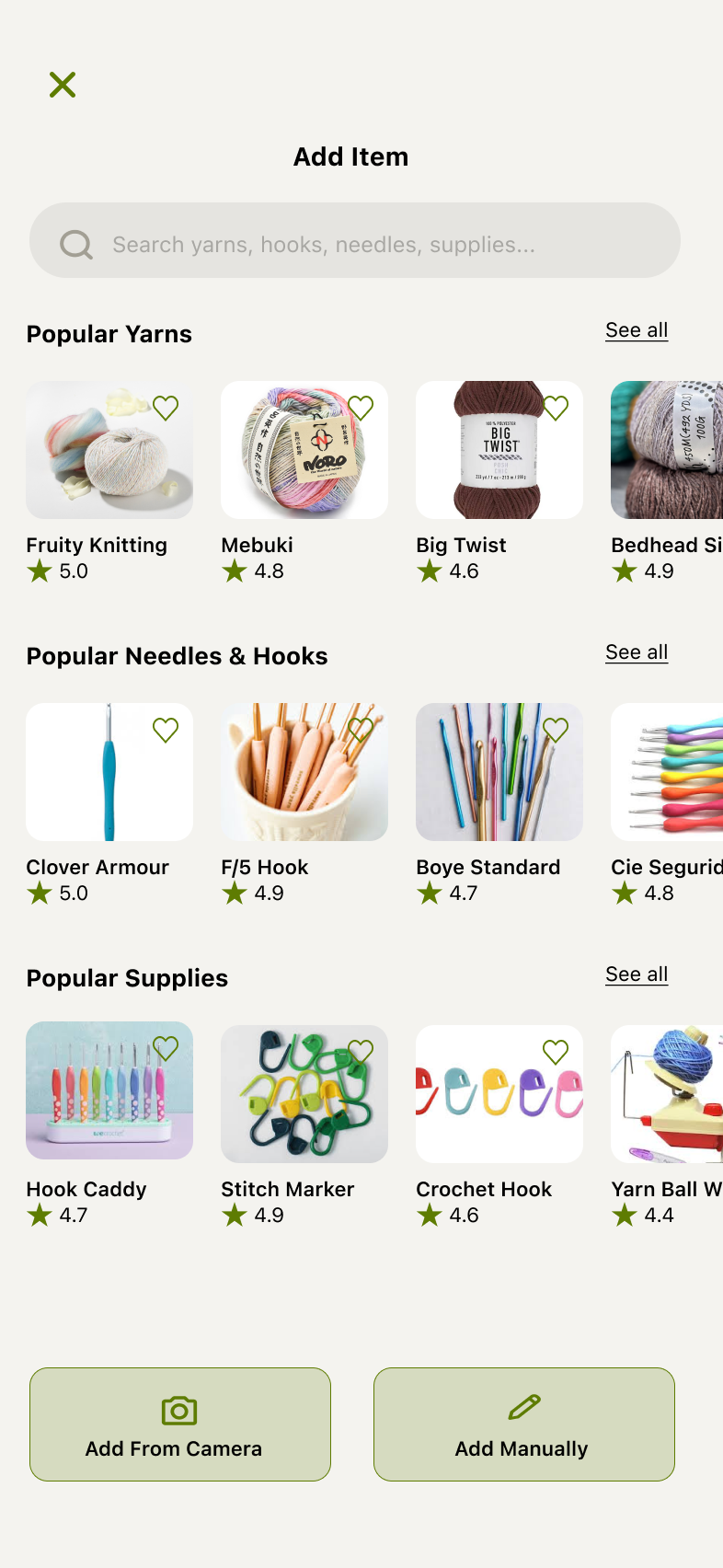
Clicking the Add button from the previous Stash screen brings up a search popup with populated popular stash items for the user to explore. Options to Add From Camera or Manually still persist.
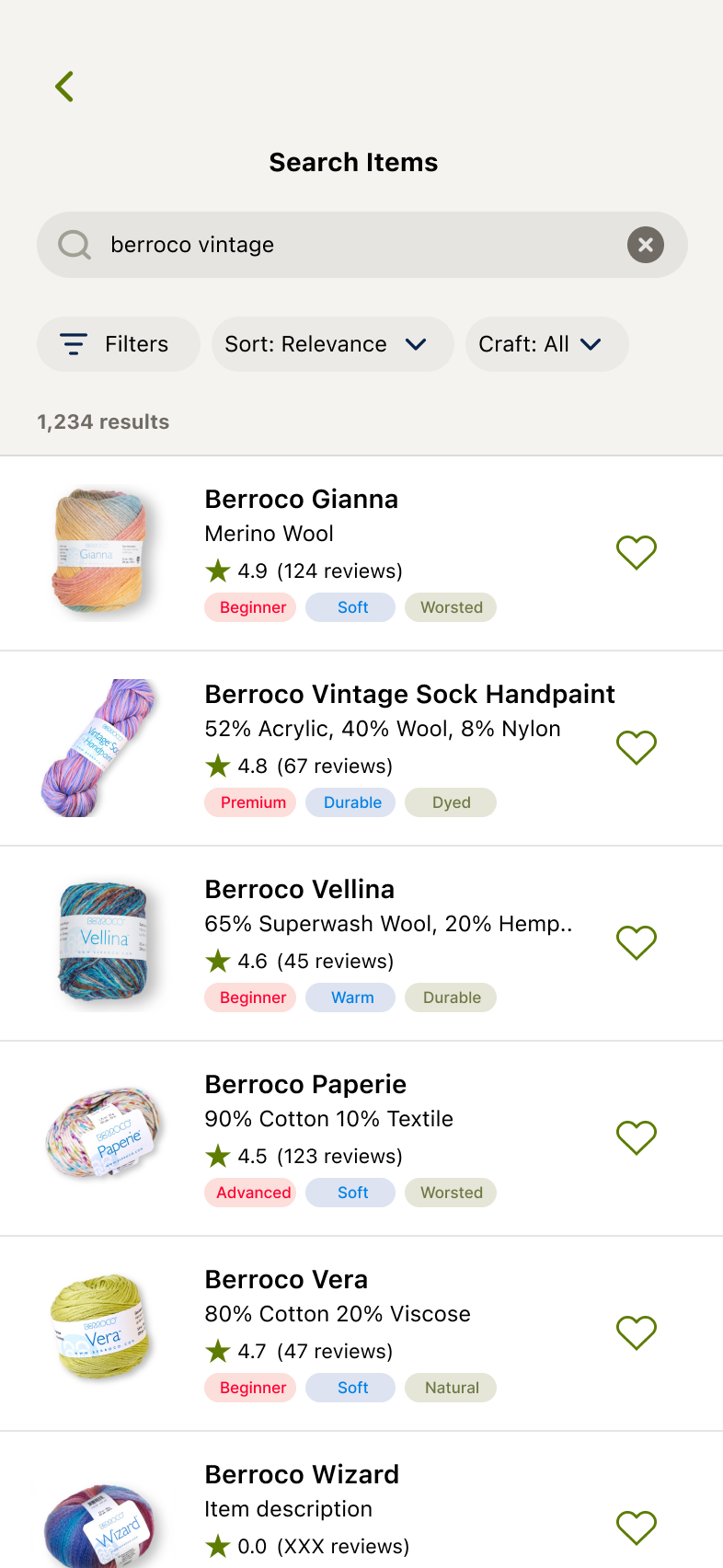
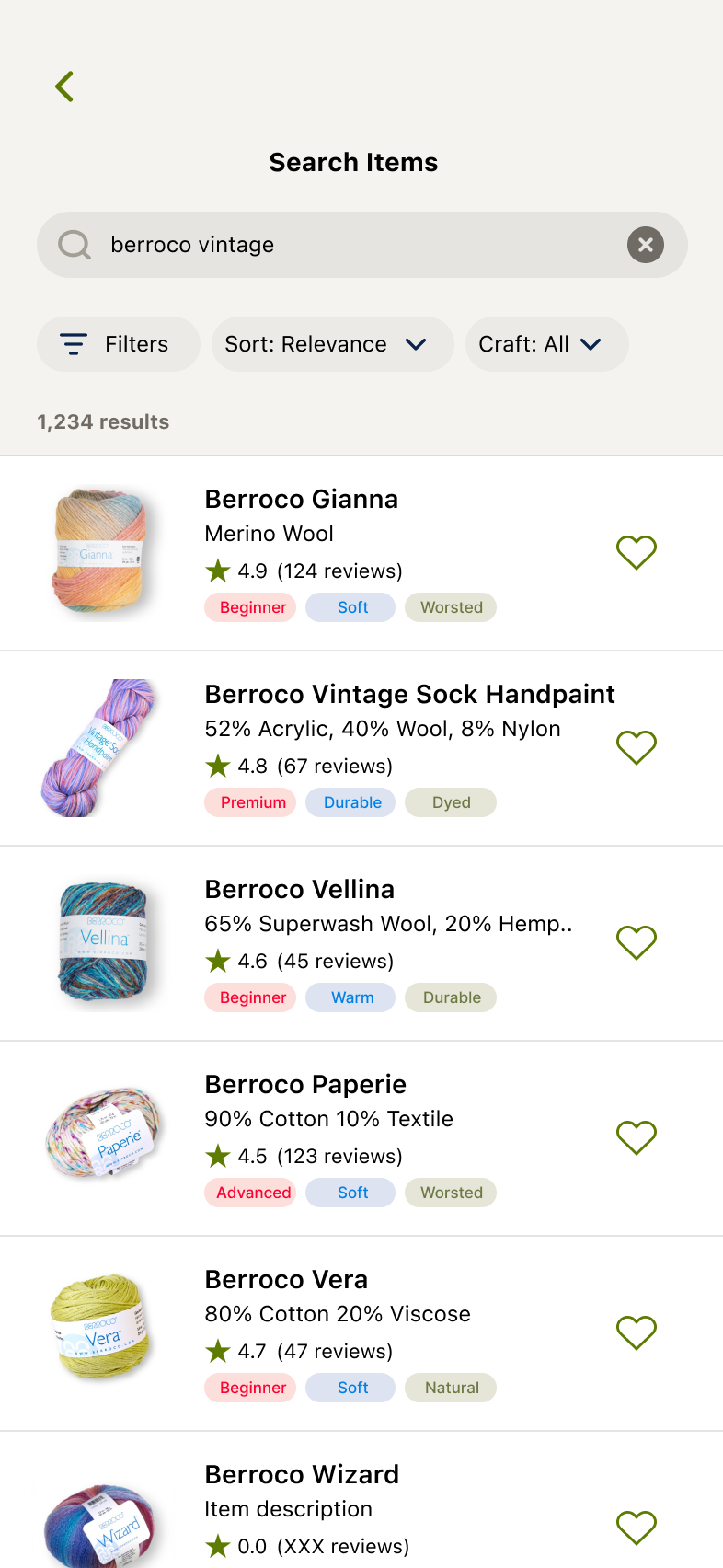
User enters search phrase and relevant items populate.
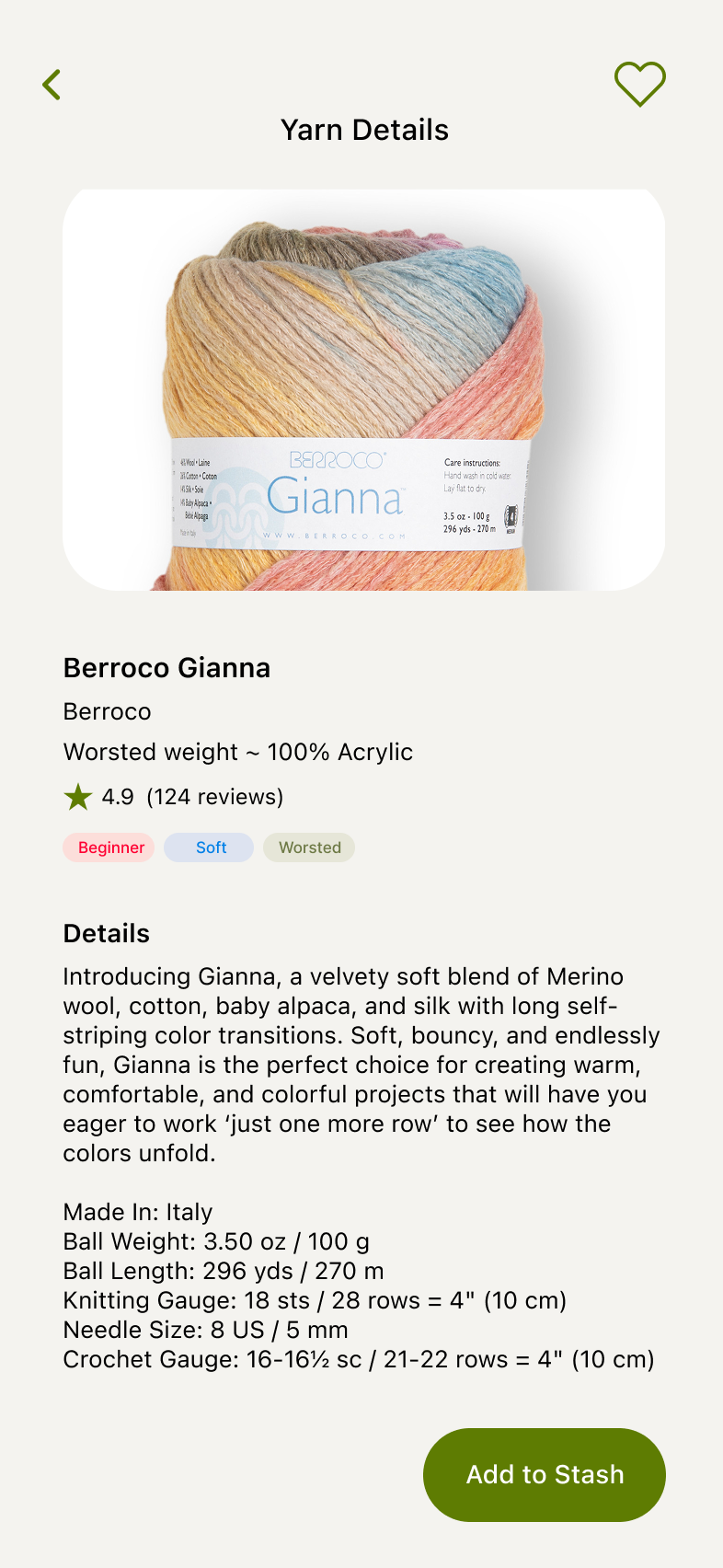
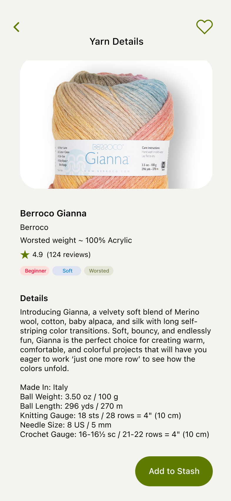
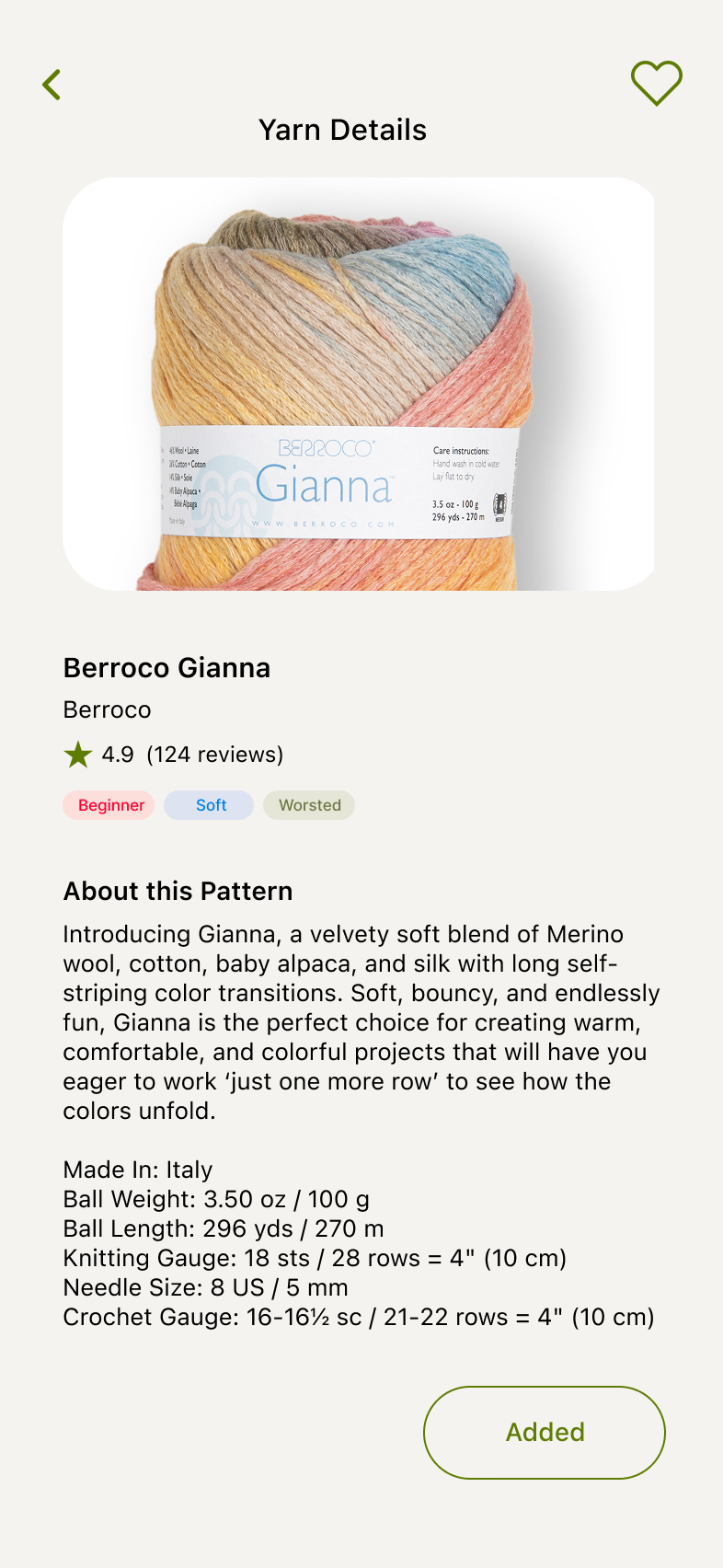
Clicking any supply item pulls up details.
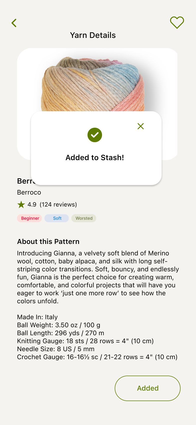
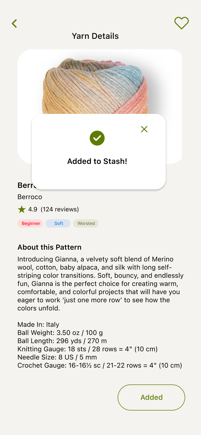
Clicking Add to Stash leads to a confirmation modal.
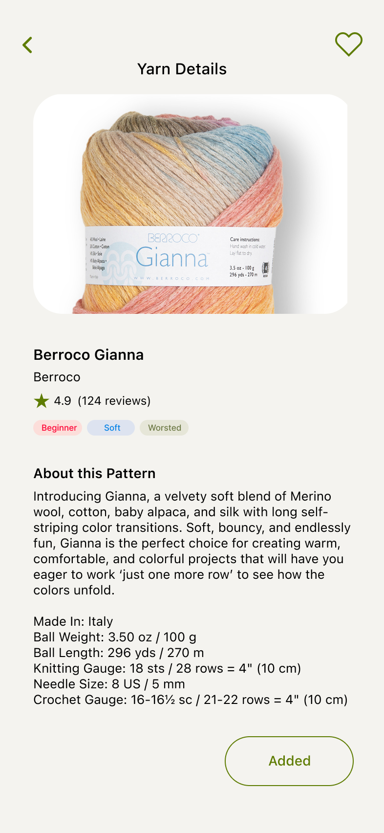
This item has now been added to the user’s Stash.
Patterns v1
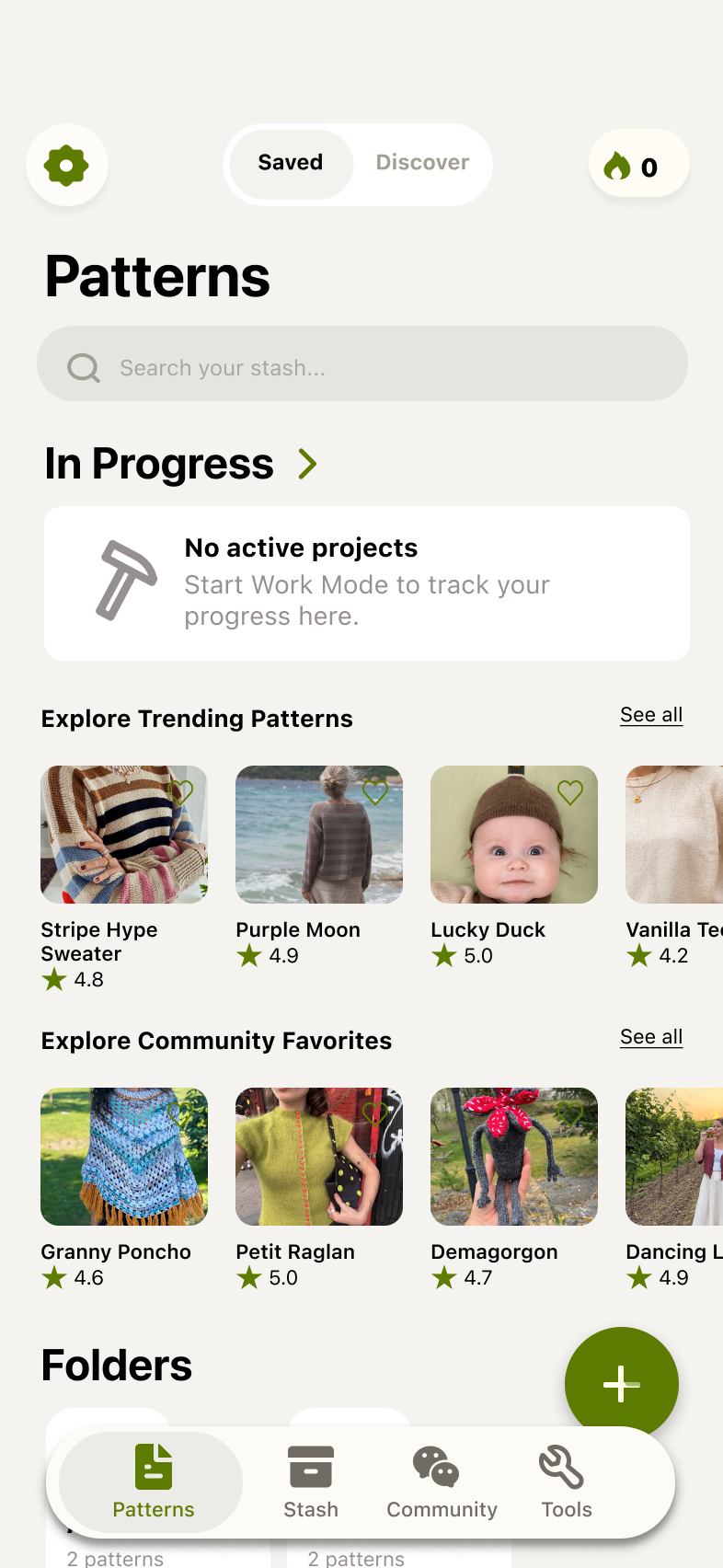
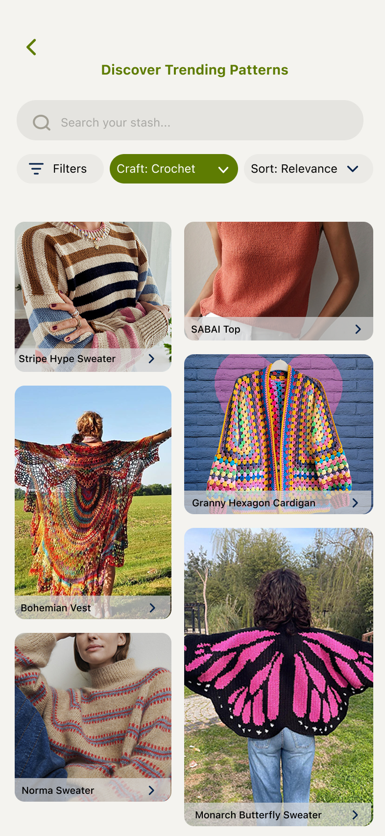
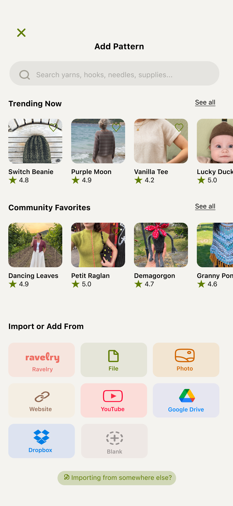
Introduced Trending Patterns & Community Favorites sections with pattern card carousels. “See all” leads to the next screen.
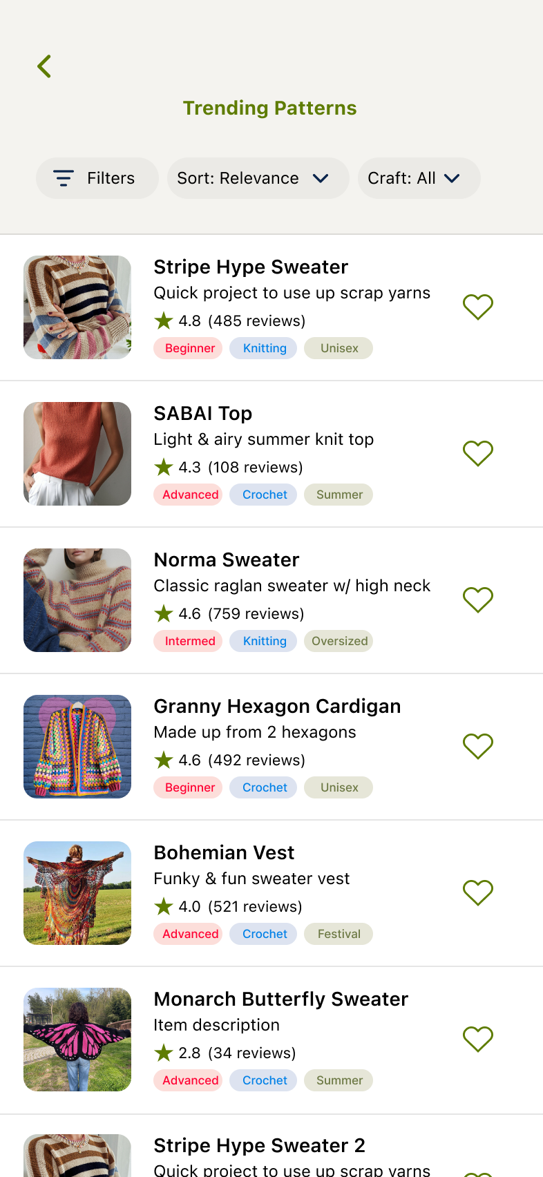
Trending Patterns or Community Favorites displays a scrollable list of discoverable patterns. Includes filters, categorizable pills, and reviews. Users can also quick-add from this screen.
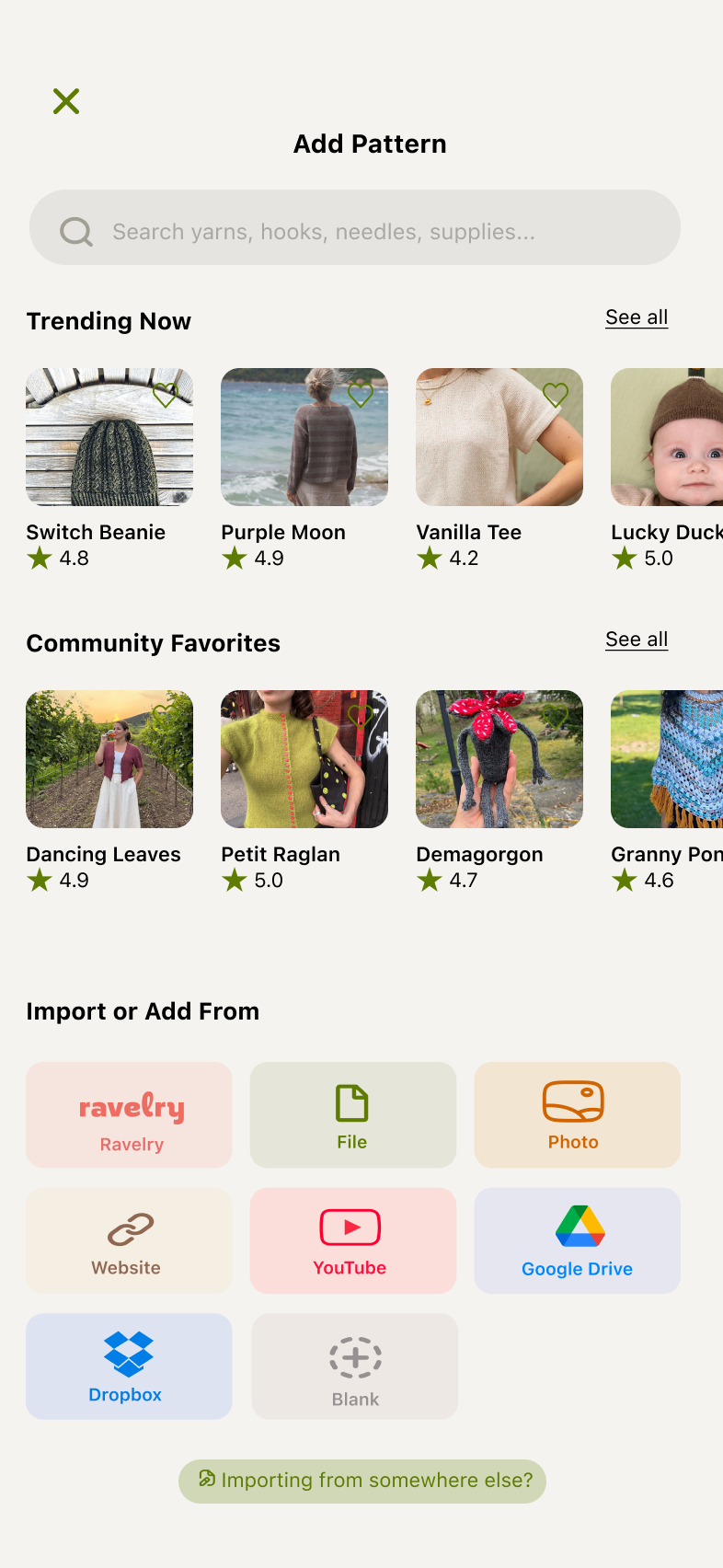
Clicking the Add button from the previous Patterns screen brings up a search popup with populated popular pattern items for the user to explore. Previous import options for patterns still exist in case the user wants to use those.
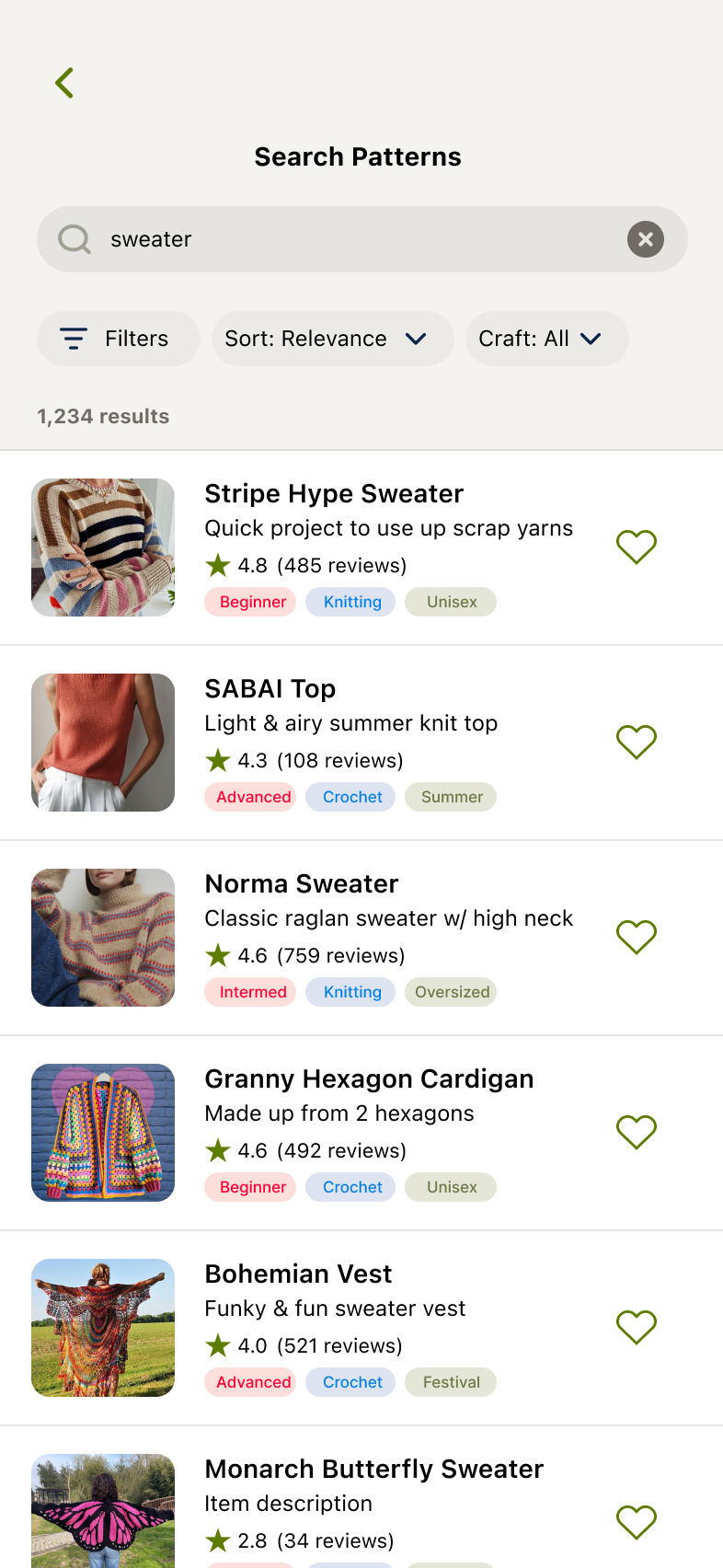
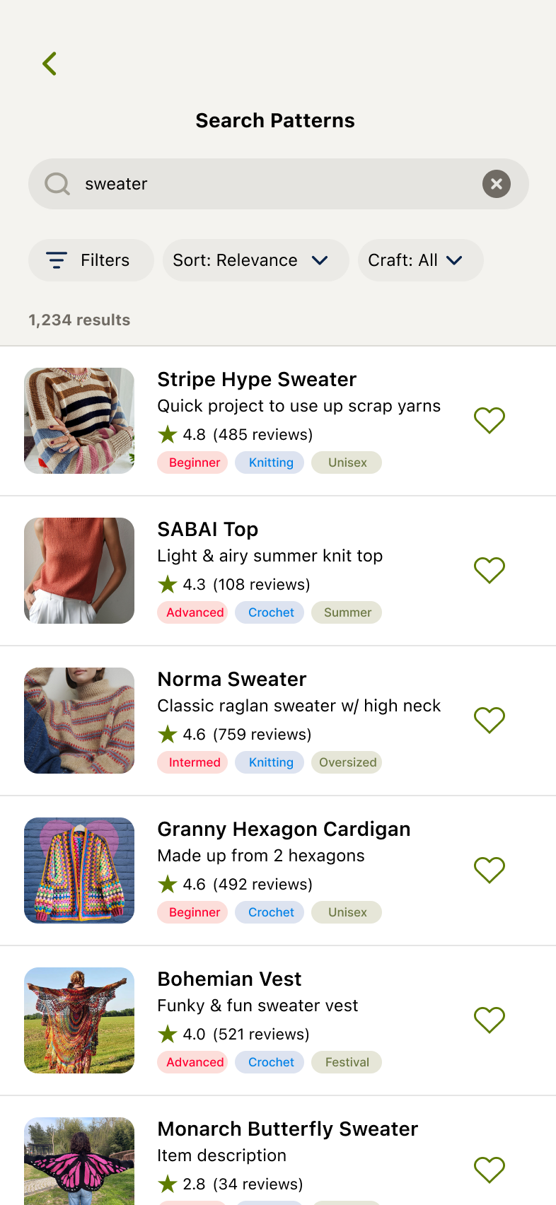
User enters search phrase and relevant items populate.
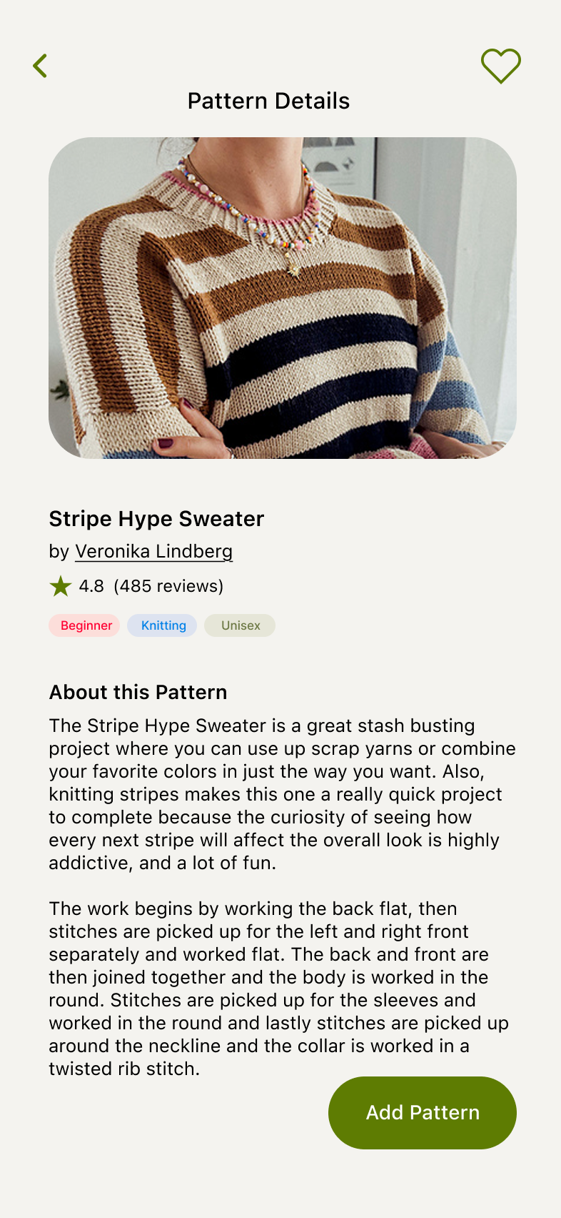
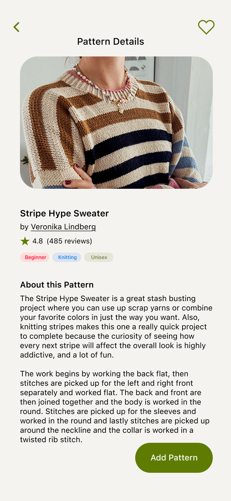
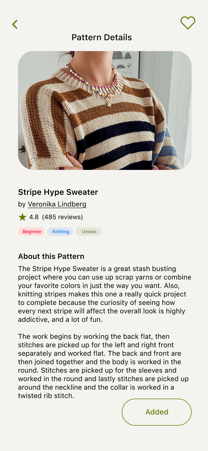
Clicking any pattern pulls up details.
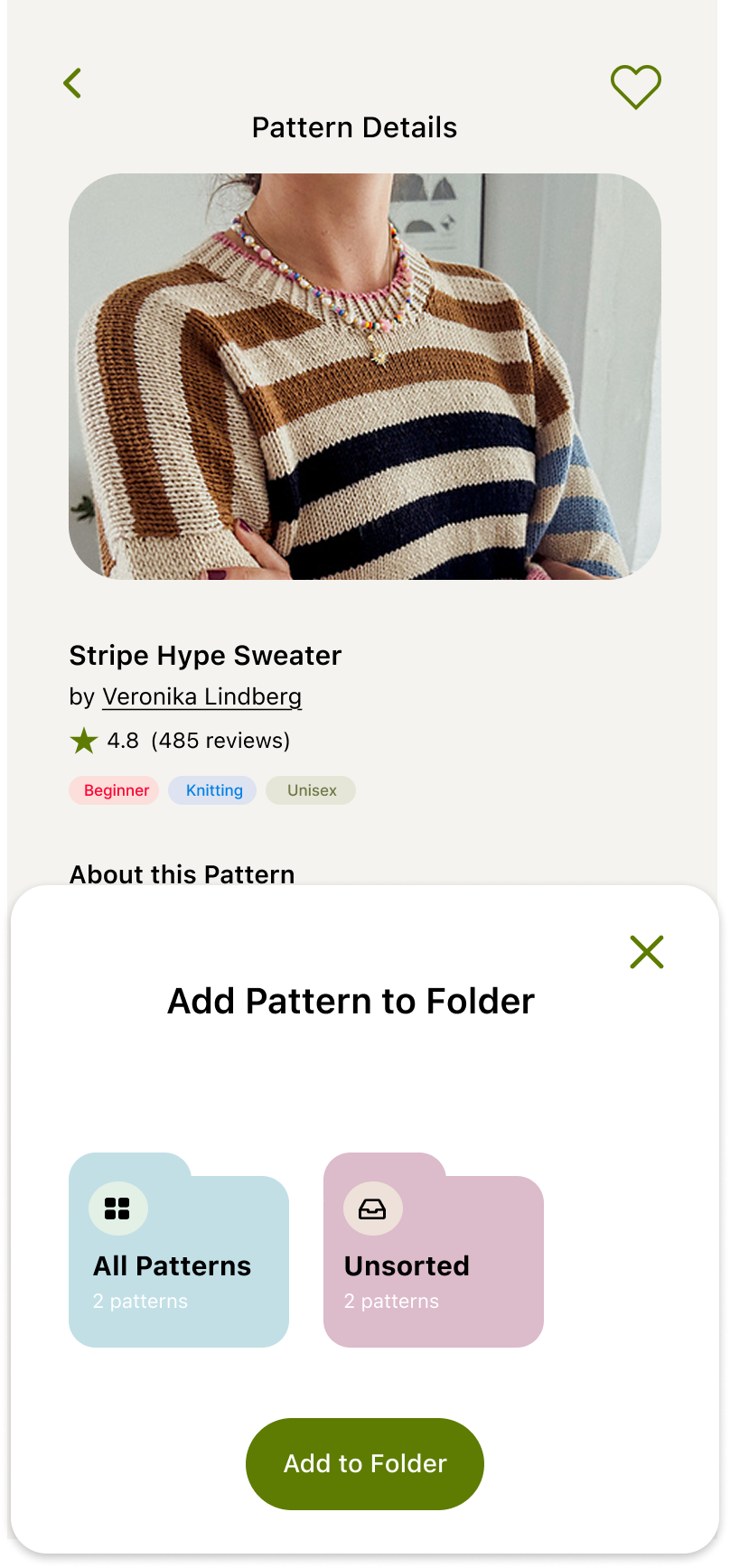
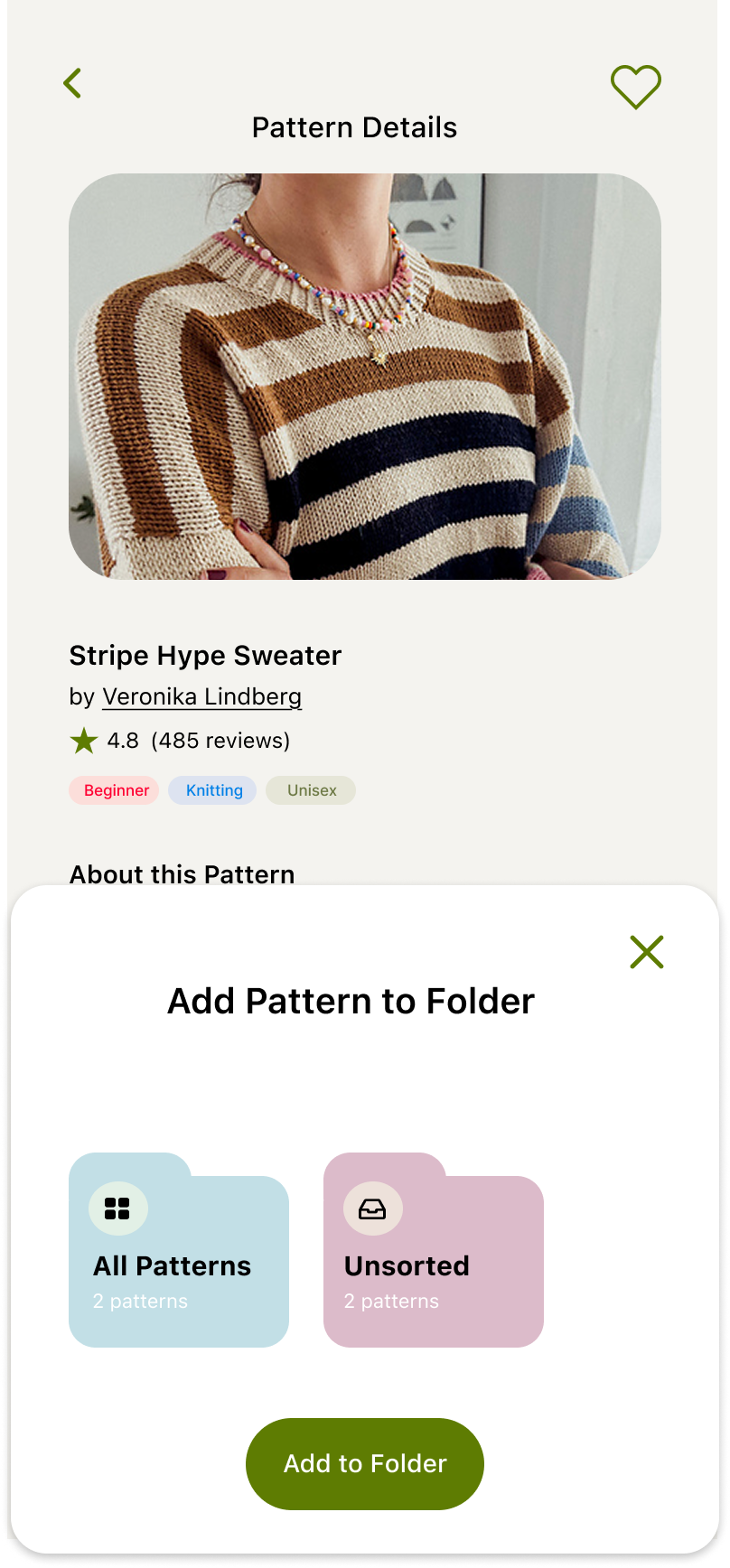
User chooses the folder to add this pattern to.
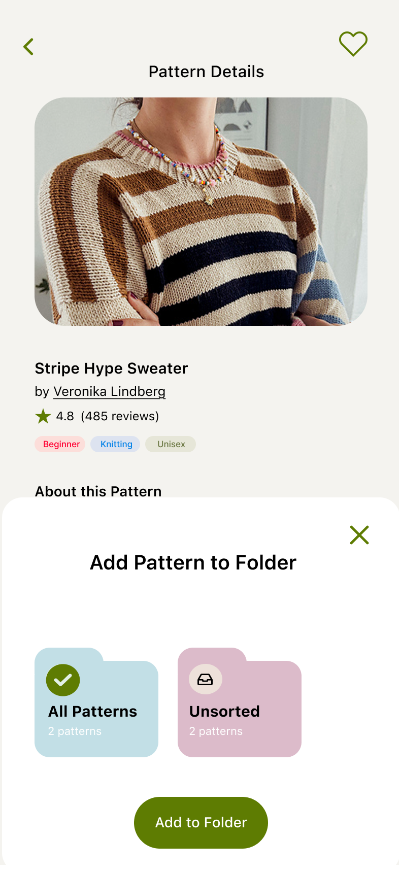
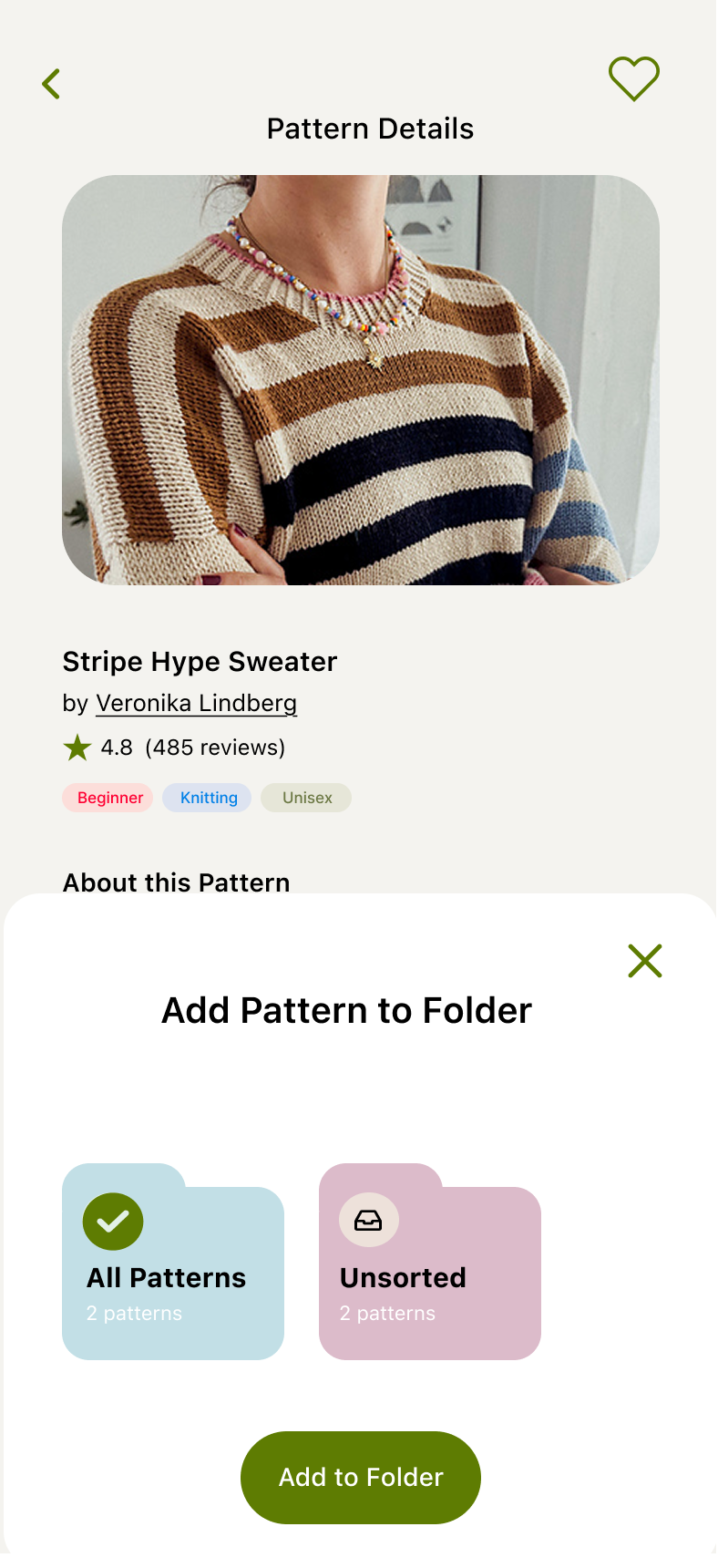
Chosen folder is highlighted.
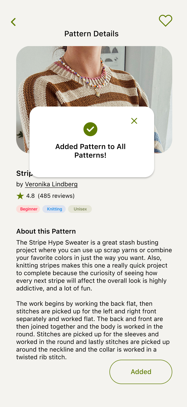
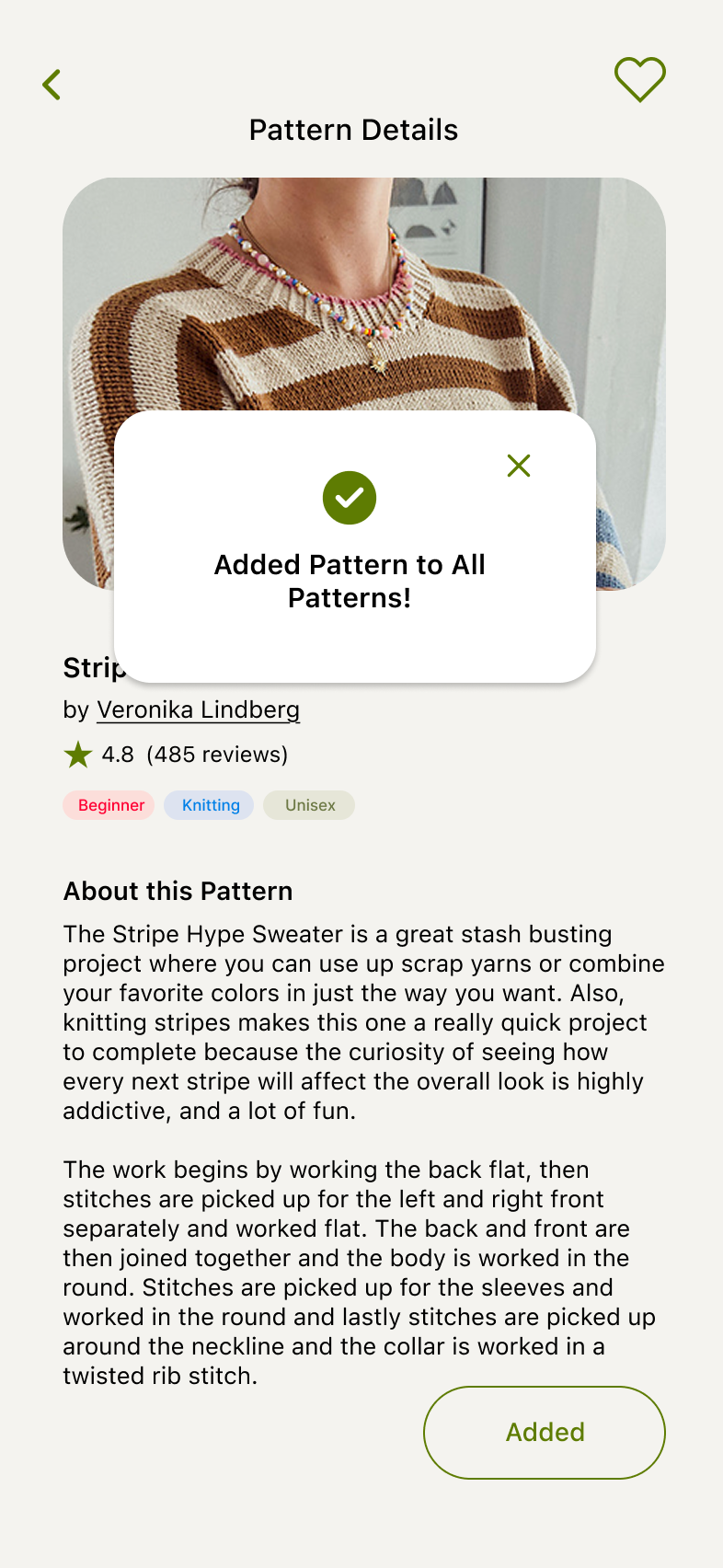
Clicking Add to Folder leads to a confirmation modal.
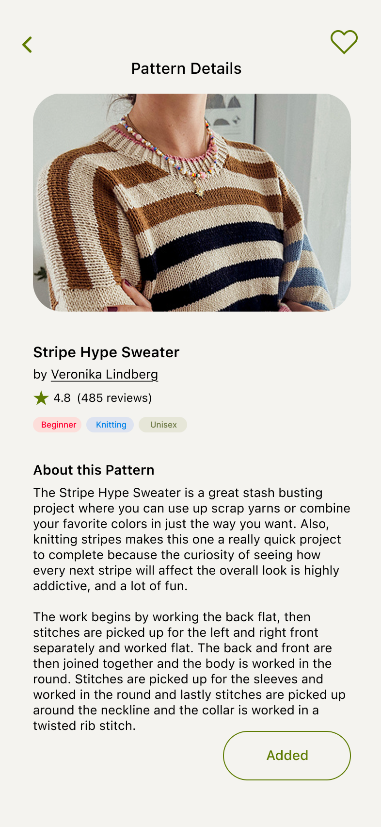
This item has now been added to the user’s Patterns.
Feedback
- Participants found the search-first flow intuitive and appreciated being able to quickly discover and add patterns without relying on manual imports.
- Participants responded positively to the visual browsing cards, noting that photos and previews made pattern exploration feel more engaging and inspiring.
- Participants valued the Trending and Community Favorites sections for surfacing popular projects, but expected the “See All” experience to provide more browsing functionality than a standard search results view.
After discussing with the founder/engineer, we decided to link the “See All” button in the Pattern & Stash screens to a relevant image-forward discovery page to encourage distinction between search results and discovery items.
09
Final Design
After incorporating feedback, these were the final designs.
Stash
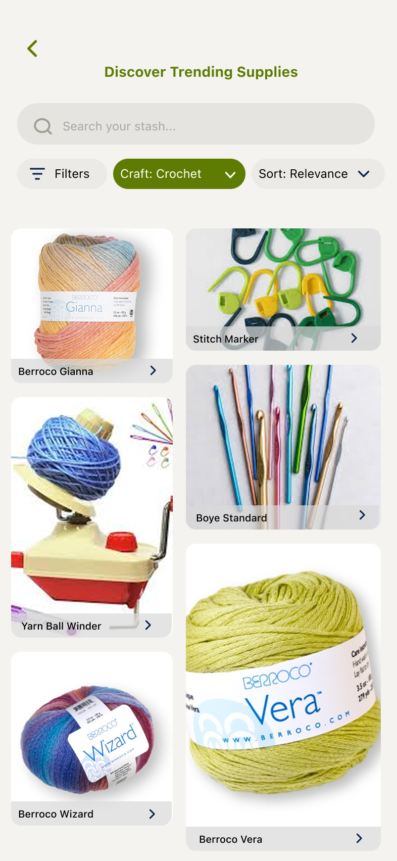
Patterns
10
Impact
By shifting the experience from manual imports and inventory management toward discovery-first workflows, the redesigned Pattern and Stash flows were projected to reduce setup friction and increase engagement during onboarding. Search-first navigation, Trending patterns, and Community Favorites made it easier for users to explore, save, and act on inspiration.
+24%
pattern creation completion
+19%
new users progressing from setup to active crafting
+17%
engagement with pattern discovery features
The founder and lead engineer tracked these metrics through product analytics dashboards and onboarding funnel monitoring to measure adoption and engagement over time.
11
Learnings
This project reinforced that users were not simply looking for organization tools; they were looking for inspiration, confidence, and opportunities to explore. While I initially focused on streamlining imports and metadata management, research revealed that community validation, visual previews, and discovery played a much larger role in decision-making.
I also learned that strong discovery experiences encourage users to stay in the app longer, browsing patterns, yarns, and community-curated content before making decisions. Shifting the experience from storage-focused to discovery-focused ultimately led to stronger design outcomes, increased engagement opportunities, and a more compelling user journey.
12
Future Opportunities
Future iterations could further personalize the crafting experience through recommendation systems that surface patterns, yarns, and supplies based on browsing behavior and project history. Additional opportunities include AI-assisted pattern discovery, project-to-stash automation, and community-generated reviews and project galleries, with the goal of increasing pattern saves and improving long-term user retention by creating a more connected crafting ecosystem.