Top10Tech
Product Design Case Study
Turning a content-heavy affiliate site into a confident product-decision tool
A redesign of Top10Tech that helps users discover and compare technology products through scannable recommendations, personalization, and stronger trust signals.
- Role
- Product Designer
- Platform
- Responsive Web
- Focus
- SEO Affiliate
Highlights
The Challenge
Top10Tech read like a content-heavy blog. Dense article roundups buried the product recommendations, making it hard for users to evaluate options and act with confidence.
My Approach
Reframe the site as an interactive decision-making tool: add personalization filters, scannable recommendation cards, and trust signals that explain why each product is recommended.
The Outcome
- +22%Product Link Click-Through Rate
- +18%Comparison Feature Engagement
- -15%Bounce Rate from Organic Traffic
01
Background
Top10Tech is an SEO-driven affiliate website that helps users discover and compare technology products through curated recommendations and reviews.
02
The Problem
While the site attracted consistent organic traffic, users lacked the tools and context needed to confidently evaluate products.
Dense content, limited personalization, and weak trust signals made decision-making difficult, reducing opportunities for engagement and conversion.
03
Design Goals
- Increase click-through rates to product recommendations
- Improve trust and credibility of recommendations
- Reduce bounce rates from SEO-driven traffic
- Create a faster, more decision-oriented browsing experience
04
Competitive Insights
I evaluated two leading competitors across overview, competitive advantage, a heuristic evaluation, and supporting notes:
| Competitor | Overview | Competitive Advantage | Heuristic Evaluation | Notes |
|---|---|---|---|---|
| Top Ten Reviews | A large-scale review and comparison platform focused on consumer technology, software, and electronics with a strong SEO-driven content strategy. | More established brand authority and larger content ecosystem than Top10Tech. |
|
|
| Best Products | An editorial commerce platform that combines product recommendations with lifestyle-focused storytelling and curated shopping content. | Stronger editorial brand presence and more polished visual identity than Top10Tech. |
|
|
From this analysis, three themes emerged:
Product comparisons should be easy to scan
Users should be able to understand key product differences without reading lengthy reviews.
Personalization improves product discovery
Filters and recommendation labels help users quickly find products relevant to their needs.
Trust signals influence conversion
Transparent recommendations, credible sourcing, and clear reasoning increase confidence in purchasing decisions.
05
Exploring Solutions
Improving Product Discovery
Users had no efficient way to narrow recommendations based on their needs. I explored several filtering approaches, including a sidebar filter system, embedded recommendation chips, and a horizontal filter bar.
I ultimately selected a horizontal filter bar because it surfaced personalization immediately while maintaining the lightweight editorial feel of the site.
Making Product Comparisons Easier
The existing experience relied heavily on long-form text, making it difficult to evaluate products quickly. I explored comparison tables, expandable detail sections, and concise comparison summaries.
I chose structured product cards with bullet-point highlights because they improved scanability while preserving the natural reading flow of the page.
Increasing Trust in Recommendations
Many recommendations lacked context, making it unclear why products were being suggested. I explored reviewer credentials, recommendation explanations, and external review integrations.
The final design surfaced recommendation rationale directly within product modules, increasing transparency without introducing visual clutter.
Creating More Meaningful CTAs
The original experience relied heavily on generic purchase-focused actions. I explored alternatives that emphasized product evaluation and decision-making.
The final design introduced contextual actions such as "Why We Recommend It" and "Compare Options" to better align with user intent and support confident purchasing decisions.
I implemented these design choices in the following wireframe and prototype.
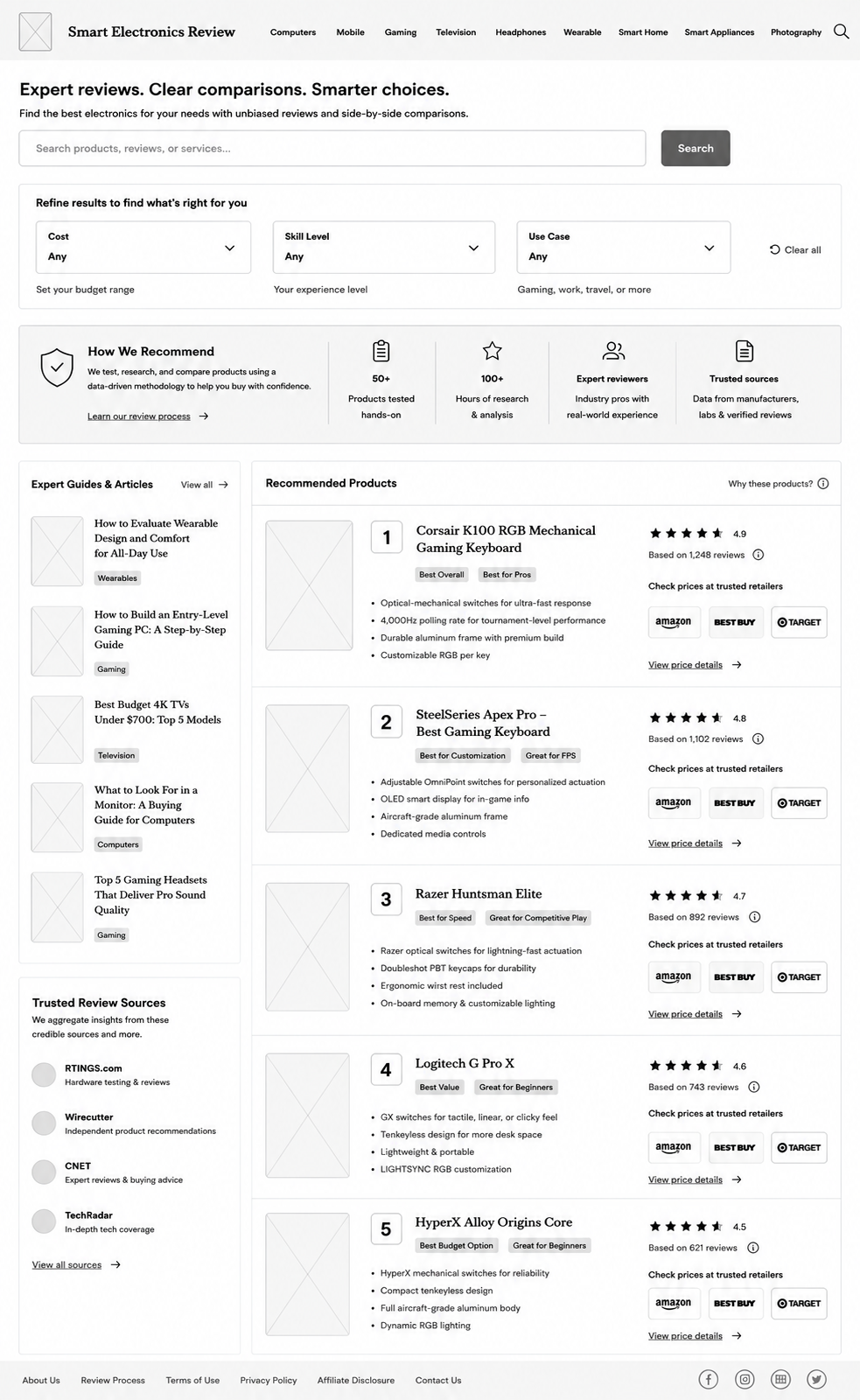
- Introduced filters for cost, skill level, and use case to help users quickly narrow recommendations based on their specific needs.
- Surfaced review methodology, expert involvement, and research volume to increase confidence in product recommendations.
- Reorganized recommendations into structured product cards with key highlights, rankings, and ratings to reduce cognitive load during evaluation.
- Labels such as "Best Overall" and "Best for Pros" help users quickly identify products that align with their goals and experience level.
- Highlighted trusted review sources to improve transparency and reinforce the credibility of product recommendations.
- Surfaced exact # of reviews to further instill credibility for ratings
Feedback
Stakeholders appreciated the introduction of filters, recommendation labels, and comparison highlights, noting that they made product discovery feel more personalized and helped users evaluate options more efficiently.
The redesigned recommendation cards were well received for surfacing key information upfront, reducing the need for users to sift through long blocks of content before making a decision.
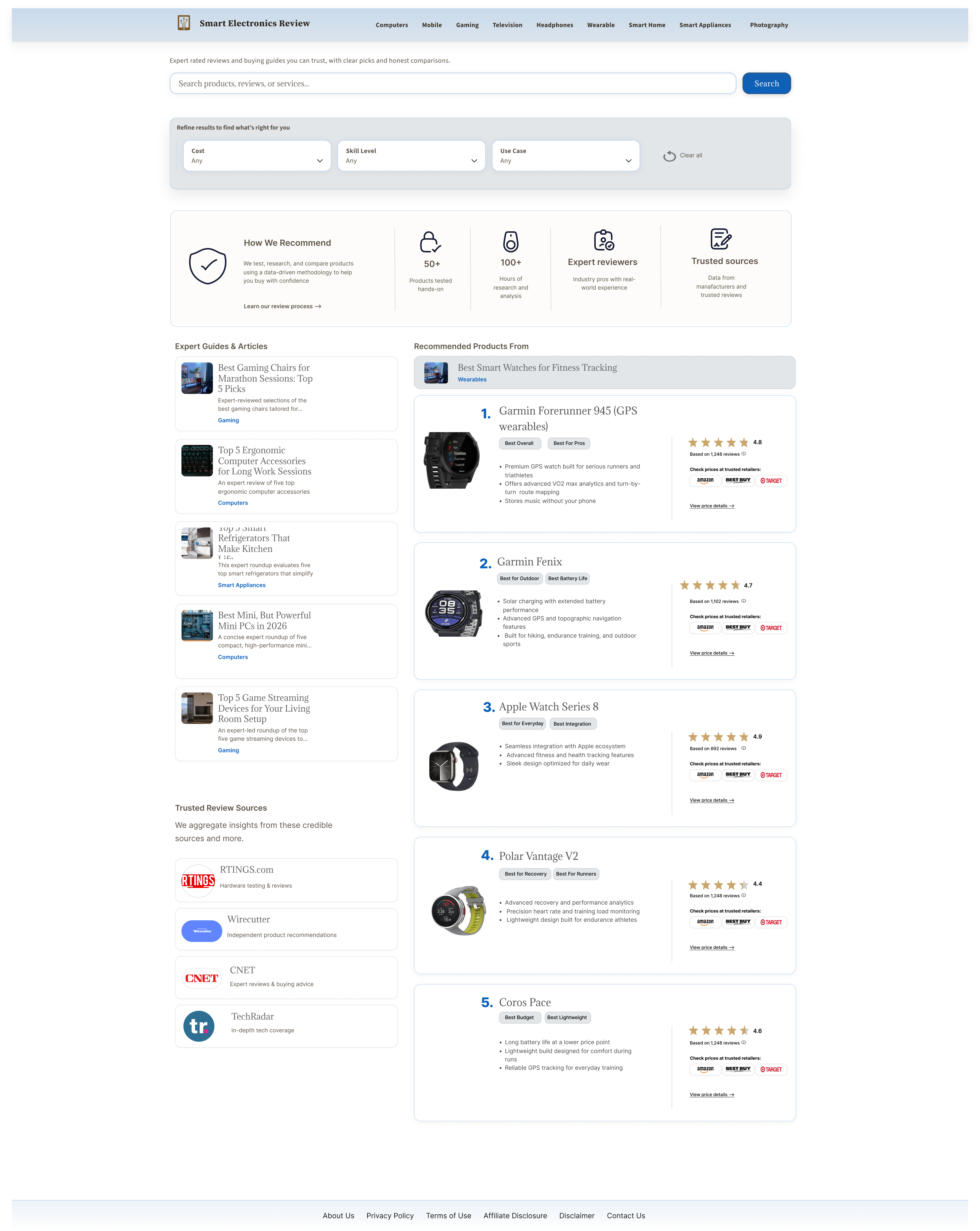
While stakeholders valued the focus on trust and transparency, they felt the dedicated Trusted Review Sources section occupied valuable space that could be better used for additional guides and articles, creating more opportunities for engagement and affiliate conversion.
06
Final Design
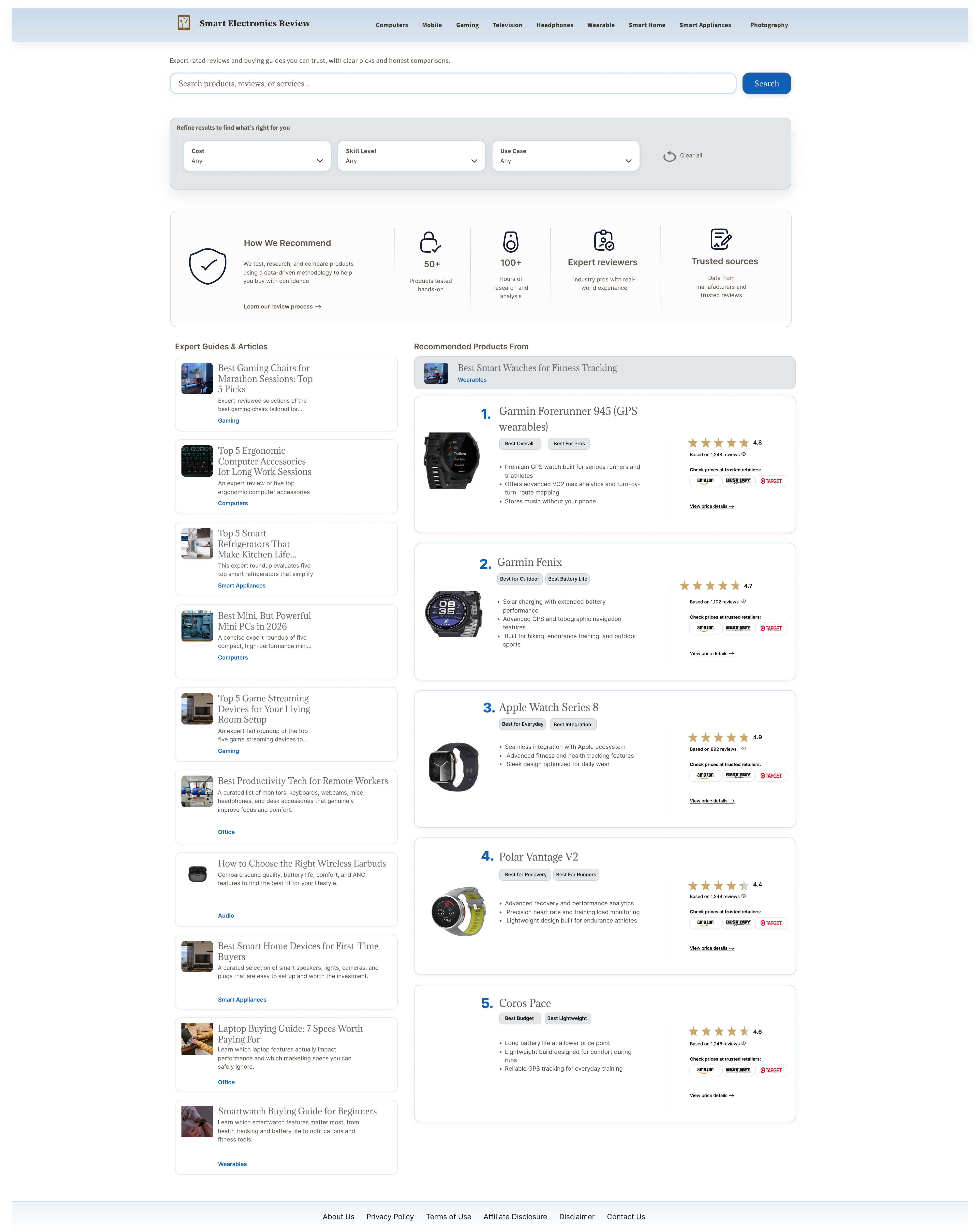
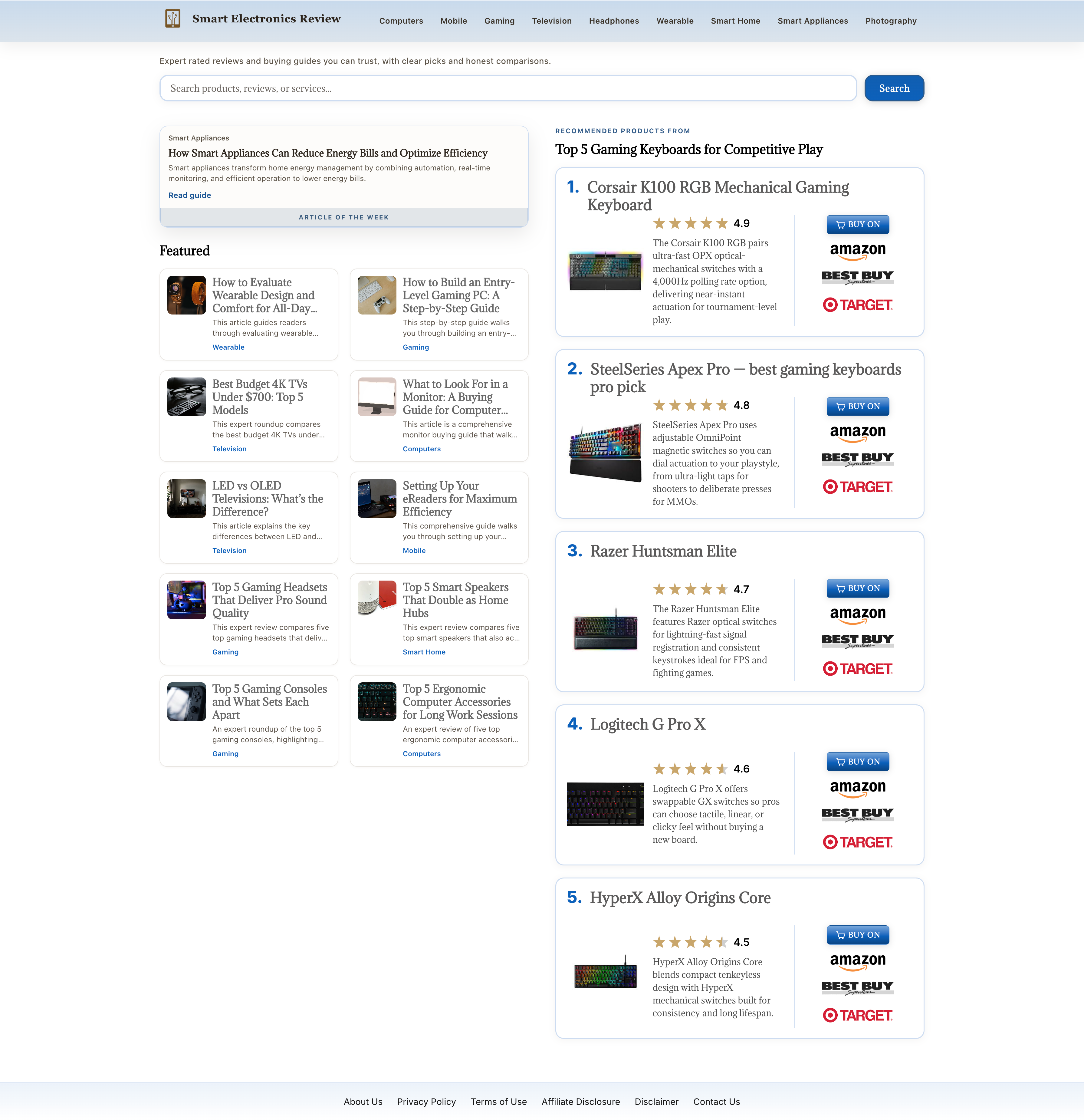
The redesign transforms Top10Tech from a blog-style content experience into a more interactive decision-making tool.
Key improvements included:
- Search and filtering by budget, skill level, and use case
- Product cards featuring recommendation labels and comparison highlights
- Trust-building modules explaining why products were recommended
- Contextual CTAs focused on decision-making rather than generic purchases
- Additional space for guides & articles. Potential for more conversion
07
Impact
Metrics were supplied following implementation of this design by the developer at Top10Tech.
+22%
Product Link Click-Through Rate
+18%
Comparison Feature Engagement
-15%
Bounce Rate from Organic Traffic
08
Learnings
This project reinforced that affiliate websites are most effective when they help users make decisions rather than simply consume content. By prioritizing scanability, personalization, and trust, the experience became more focused on guiding users toward confident purchasing decisions.
09
What's Next
Future